Over the past decade, I have helped shape and protect On Point’s visual identity as the organization has grown and evolved. My work in brand management has focused on creating consistency, clarity, and accessibility, ensuring that every visual touchpoint reflects On Point’s professionalism, inclusivity, and mission. This section highlights that evolution and the systems now in place to sustain it.
Brand Evolution
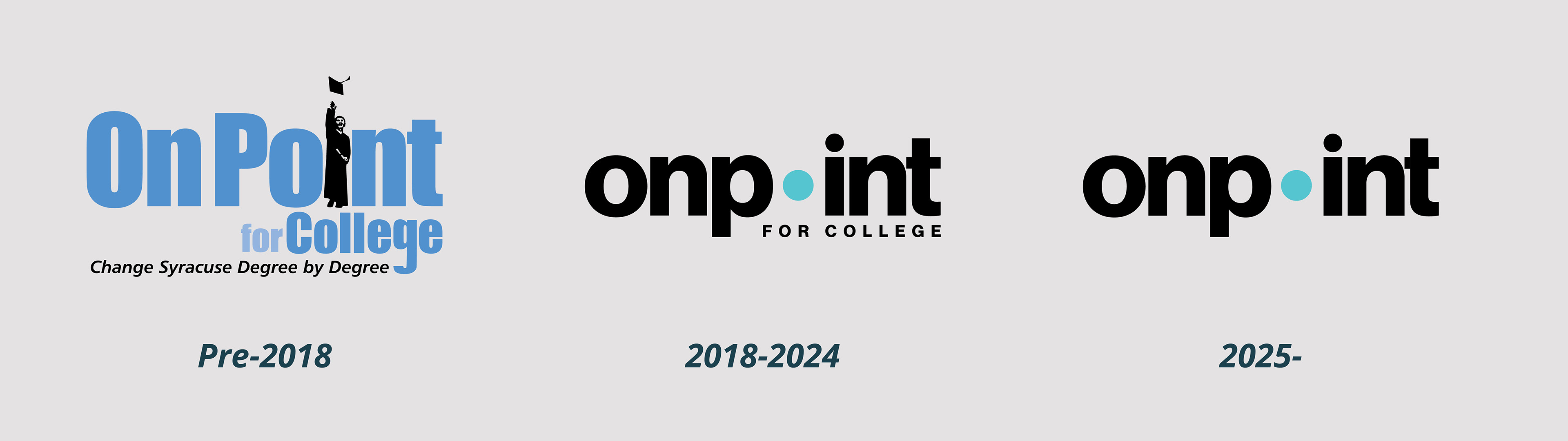
Pre-2018 Branding
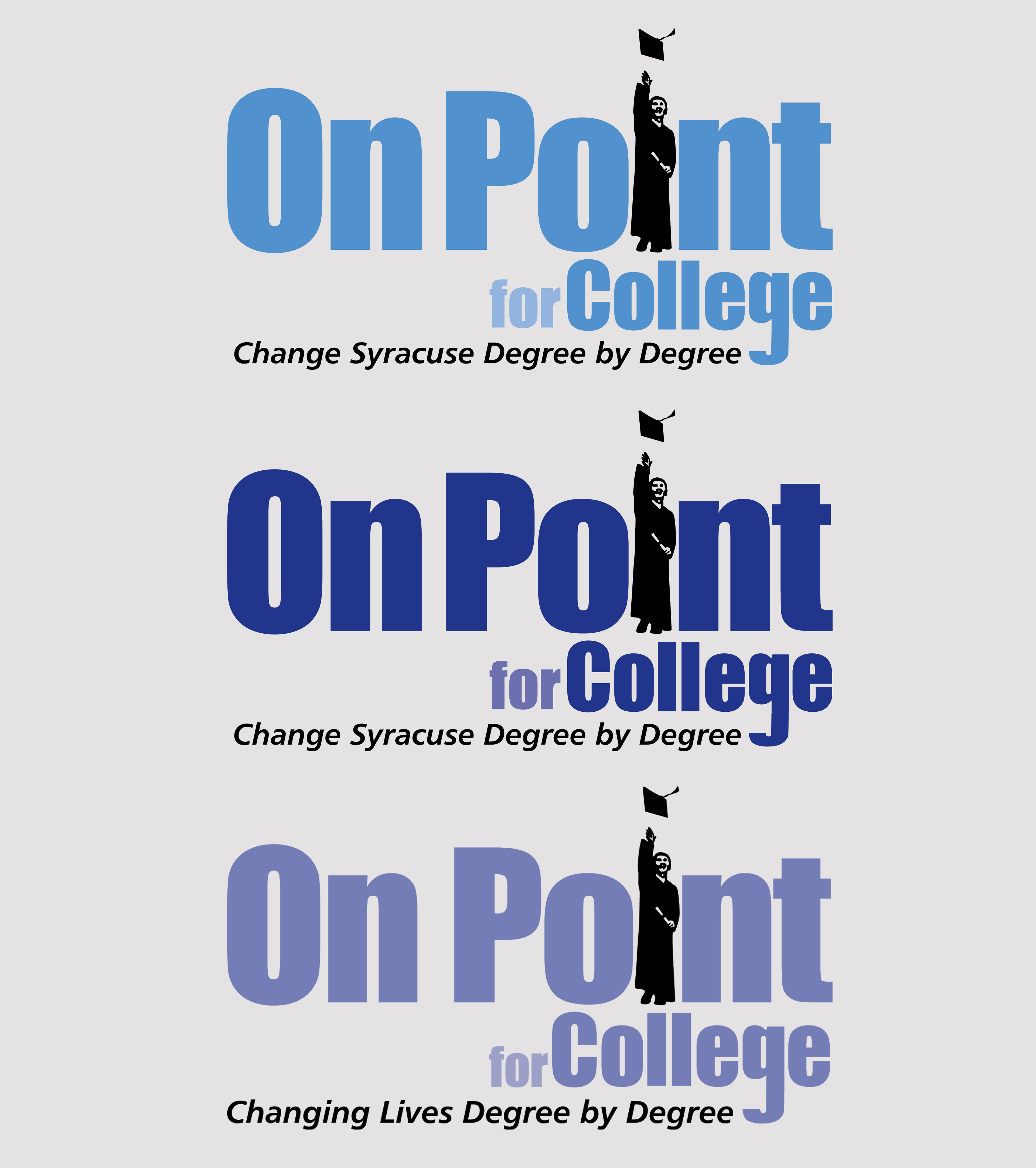
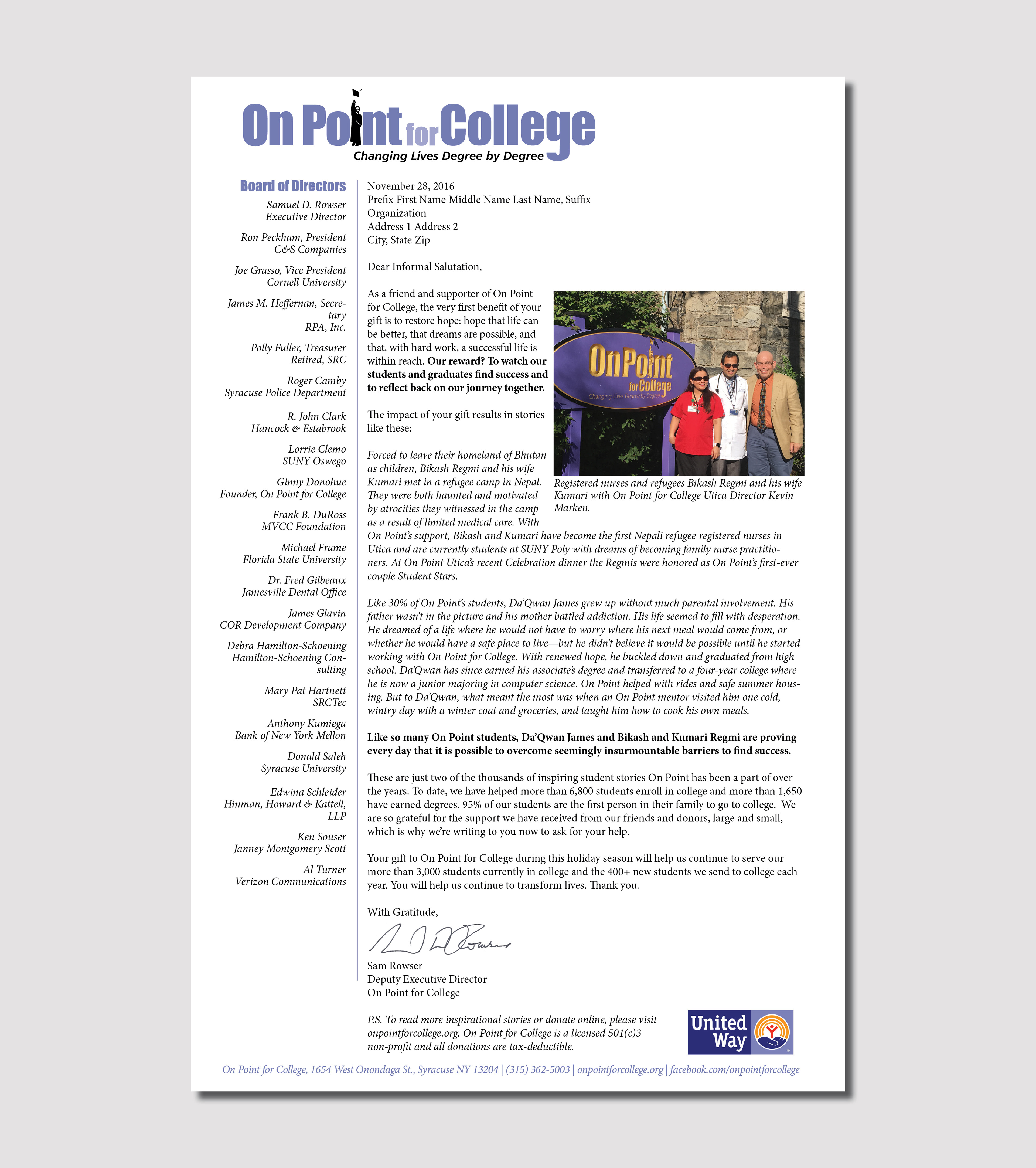
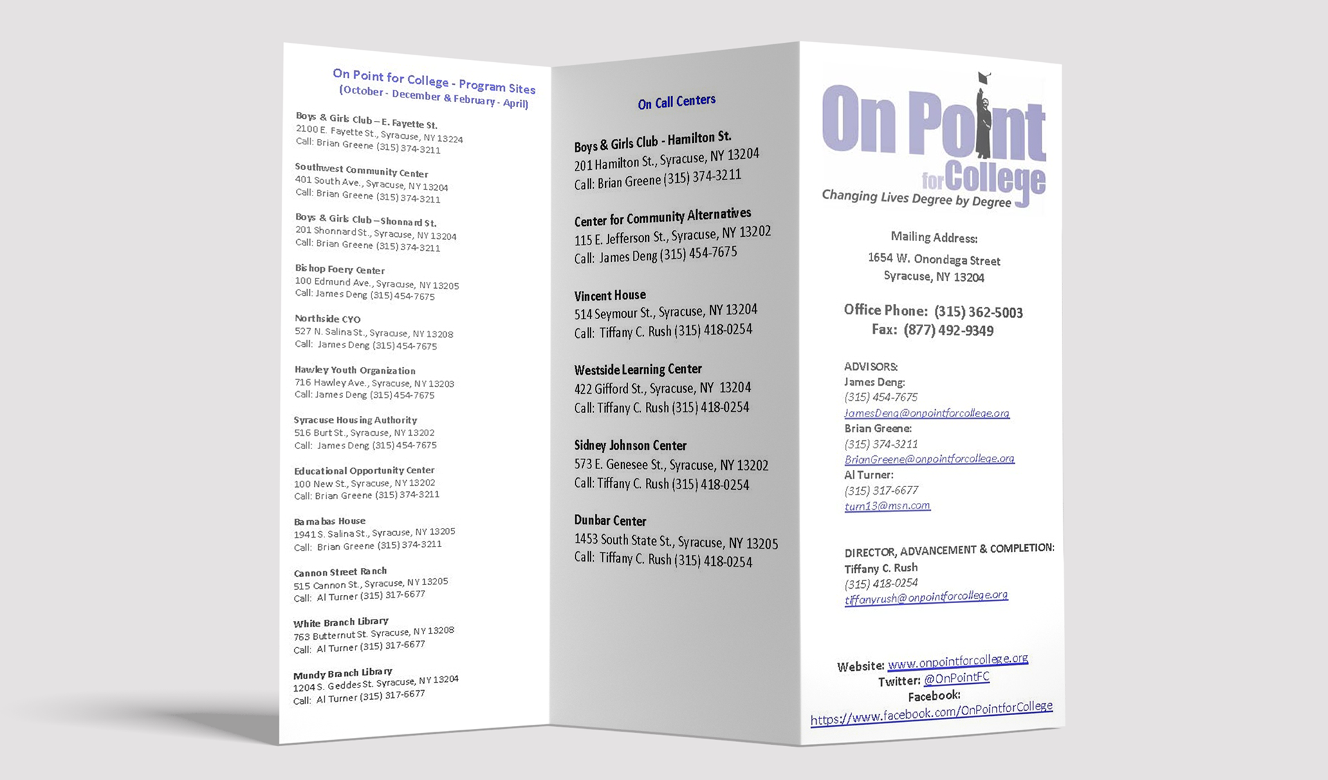
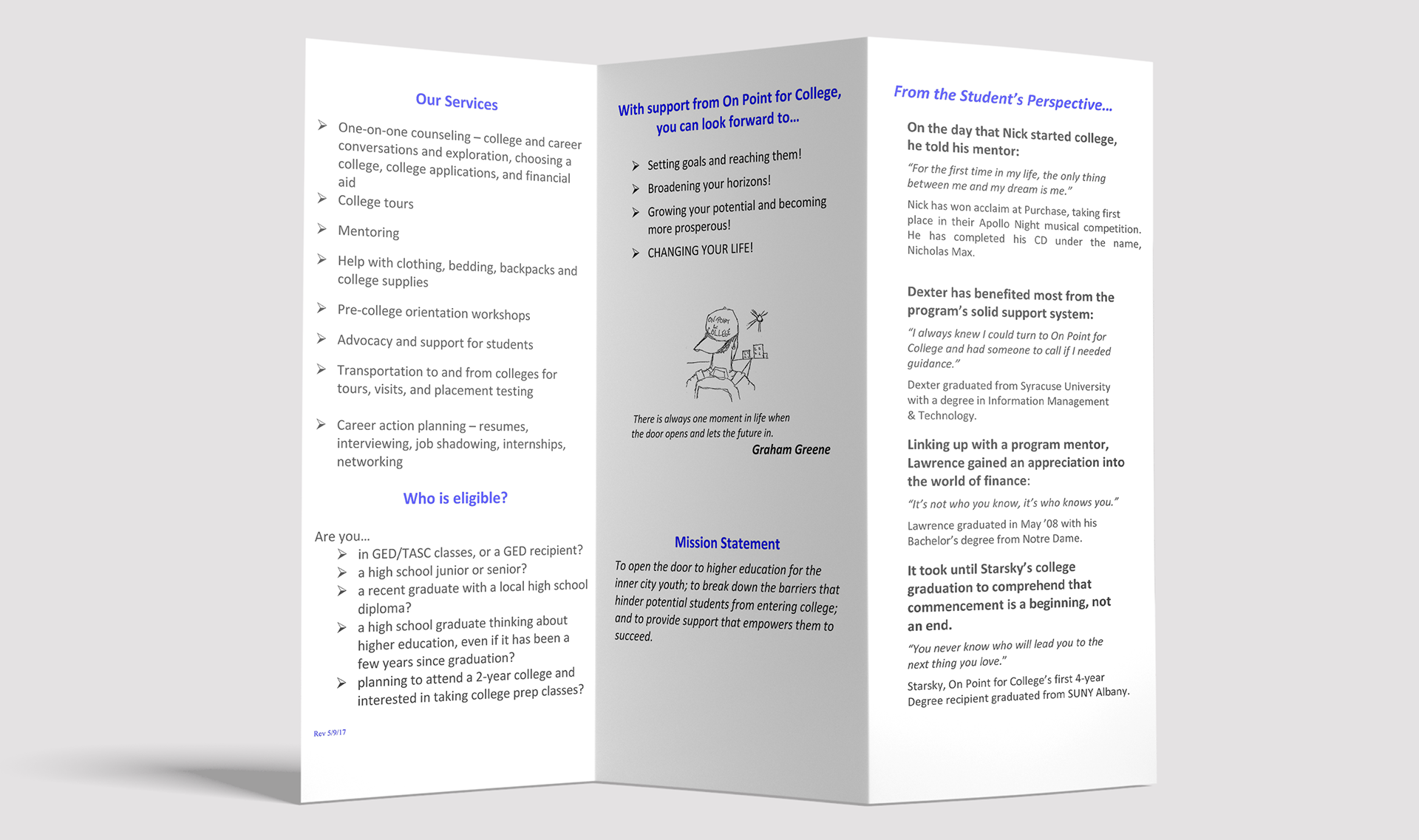
On Point’s original branding leaned heavily into its college-focused origins, featuring a graduate silhouette in place of the “I” in On Point and the word College built directly into the name. Designed in the Impact font, the logo served the organization well in its early years, but without brand management expertise or design tools, it proved difficult to build a cohesive visual system around it. Colors varied across uses, and the identity wasn’t applied consistently across materials or departments.
Below: color inconsistencies in the old logo, an old annual appeal letter, and an old program brochure.

2018 Rebrand
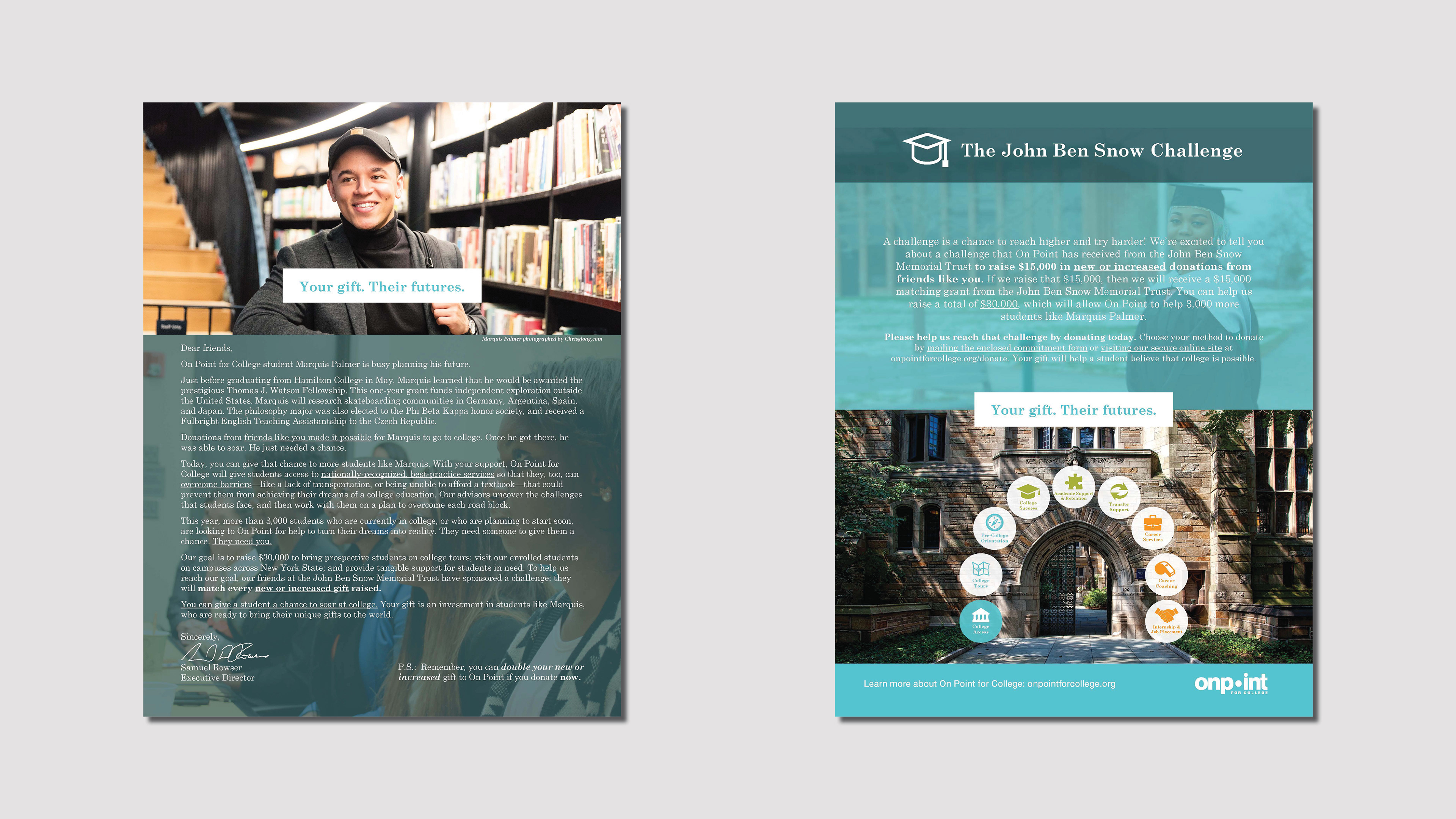
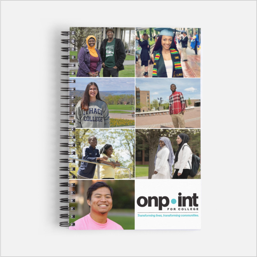
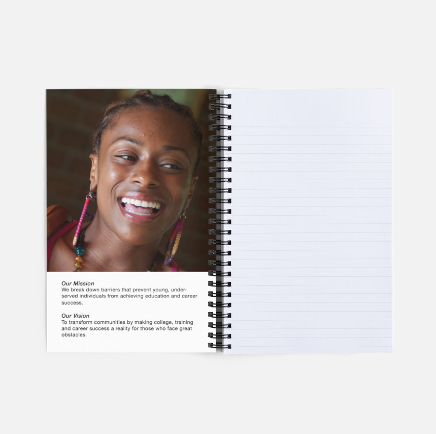
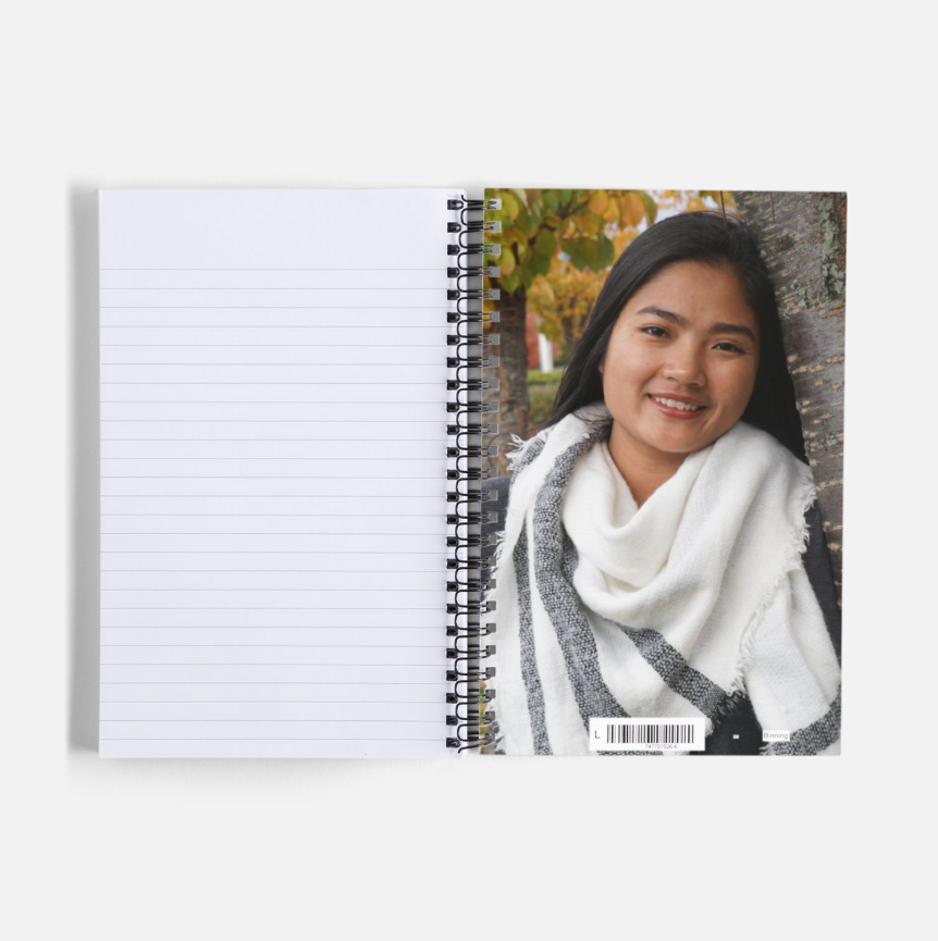
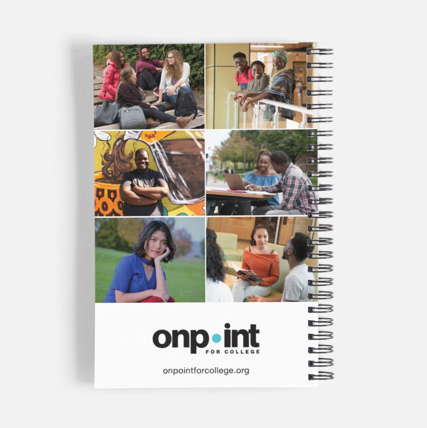
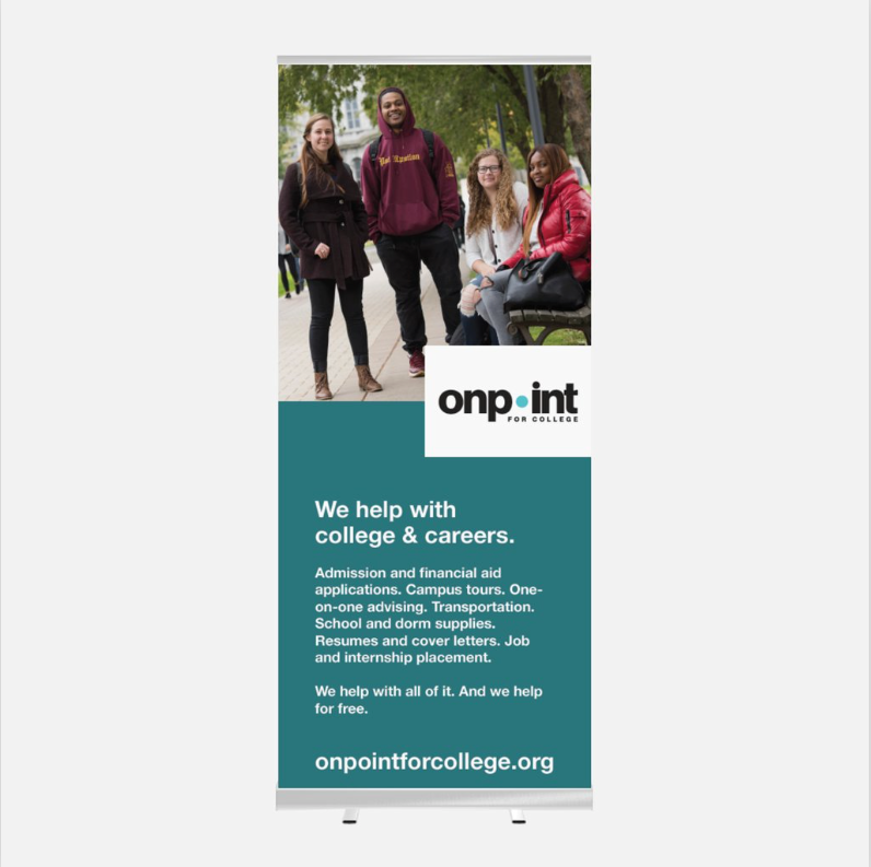
The 2018 rebrand introduced a more contemporary, professional identity, replacing the dated typography with Helvetica Neue Grotesk and refining the logo into a stronger, more credible mark. It also established a cohesive visual framework for the first time, introducing dedicated brand fonts and a defined color palette that could be used consistently across applications. This update positioned On Point as a mature organization nearly two decades into its mission while still honoring its college-access roots.
Below: a more modern appeal letter, a branded notebook, a retractable banner, a poster, and a handout for government officials.
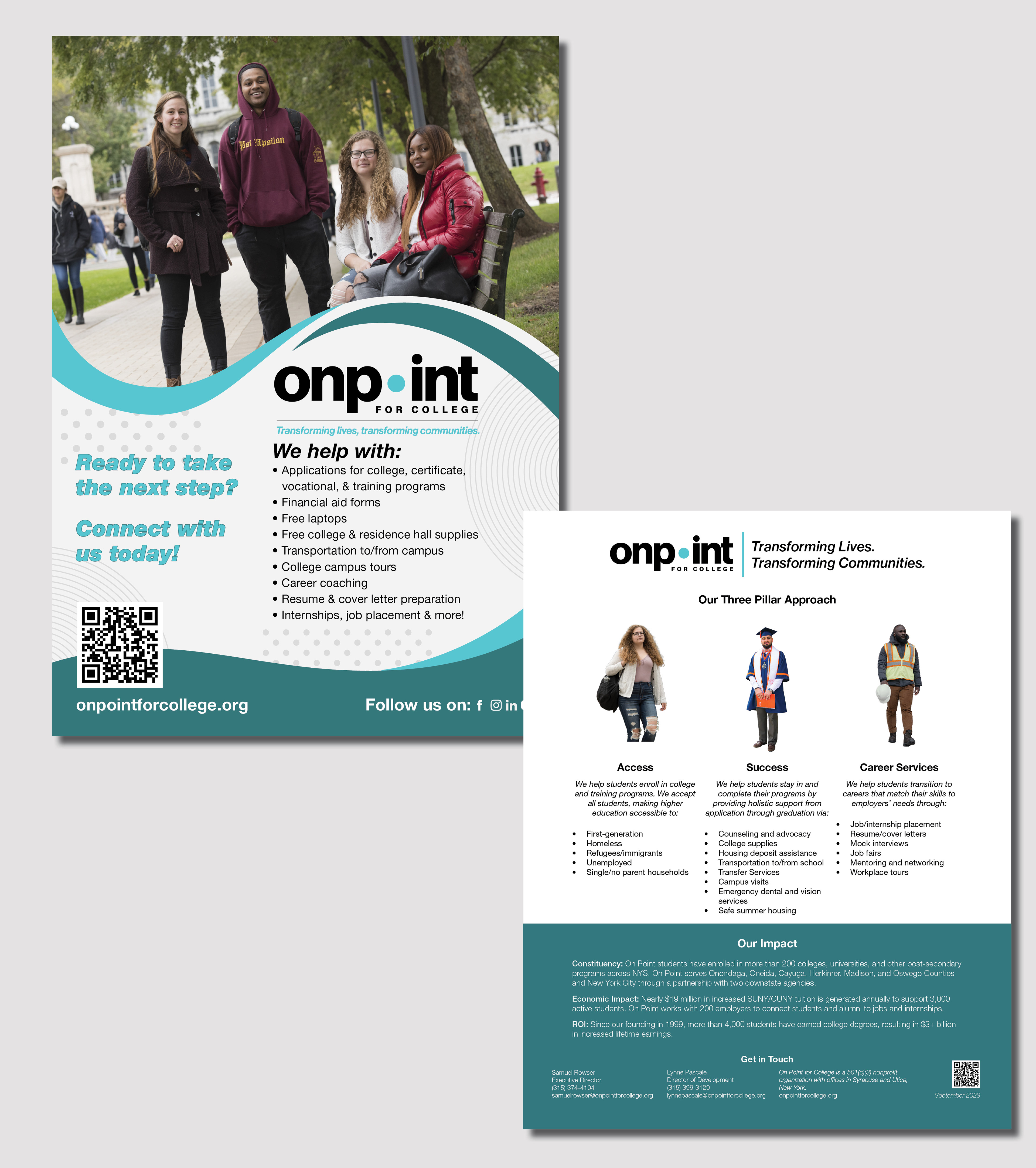

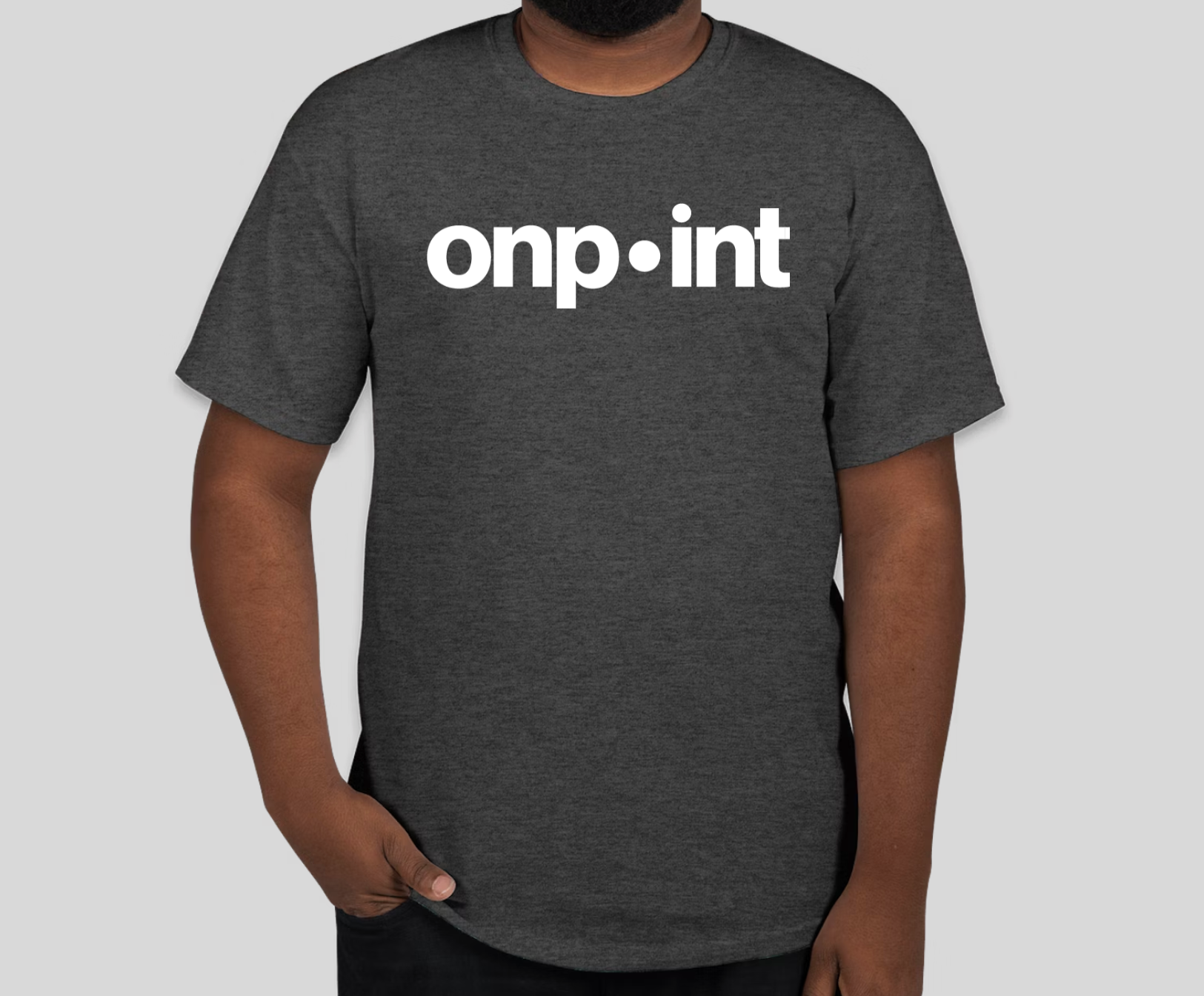
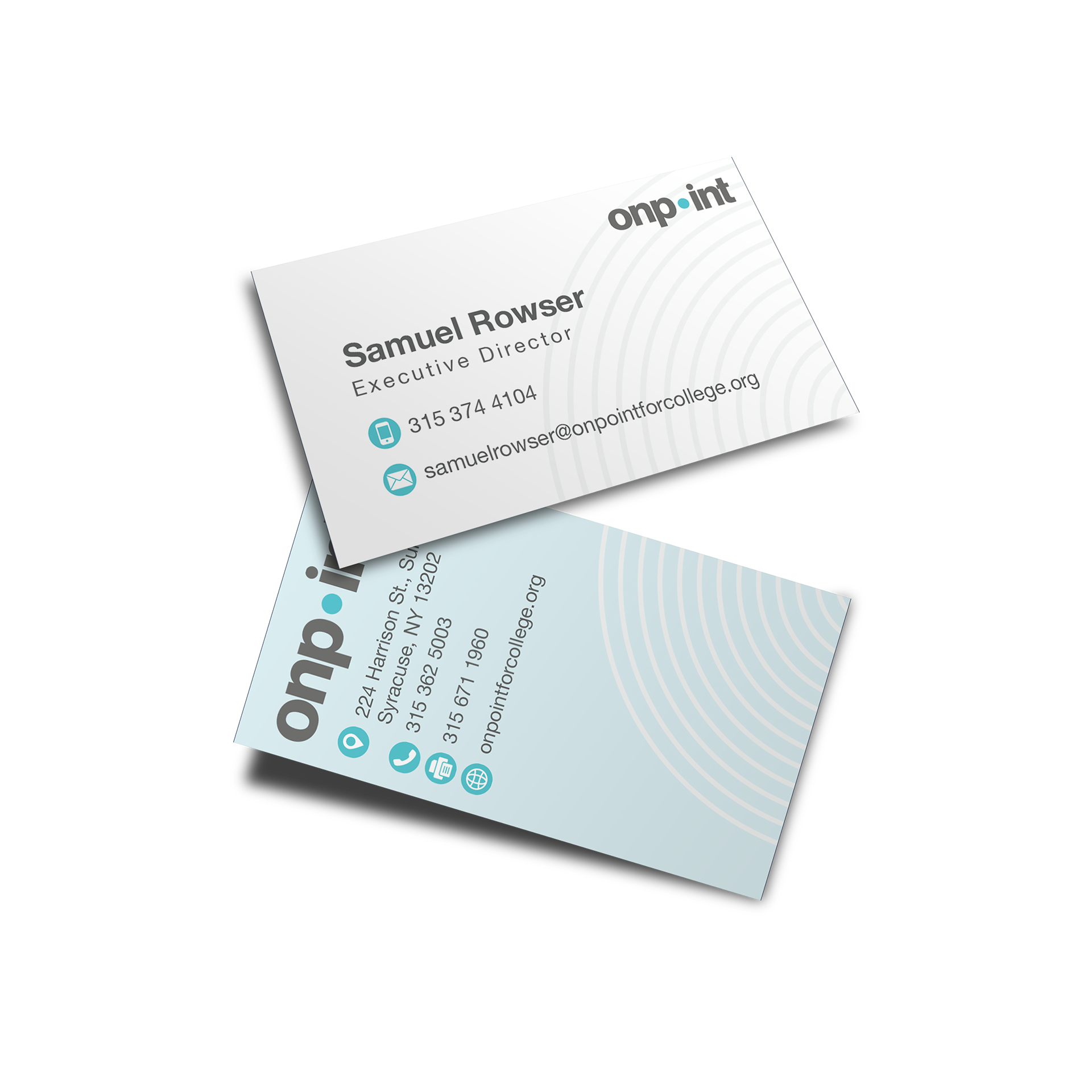
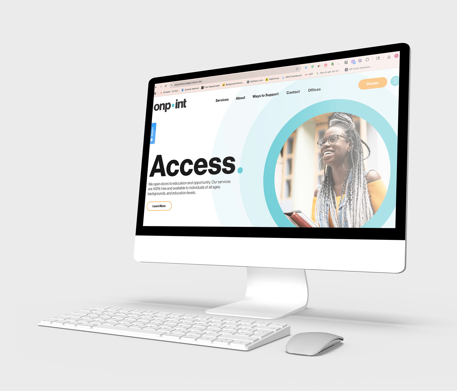
2025 Soft Rebrand
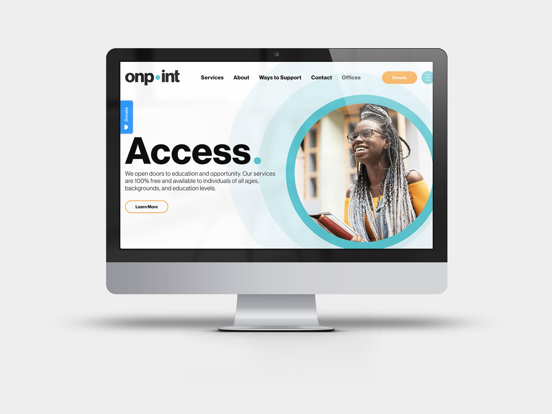
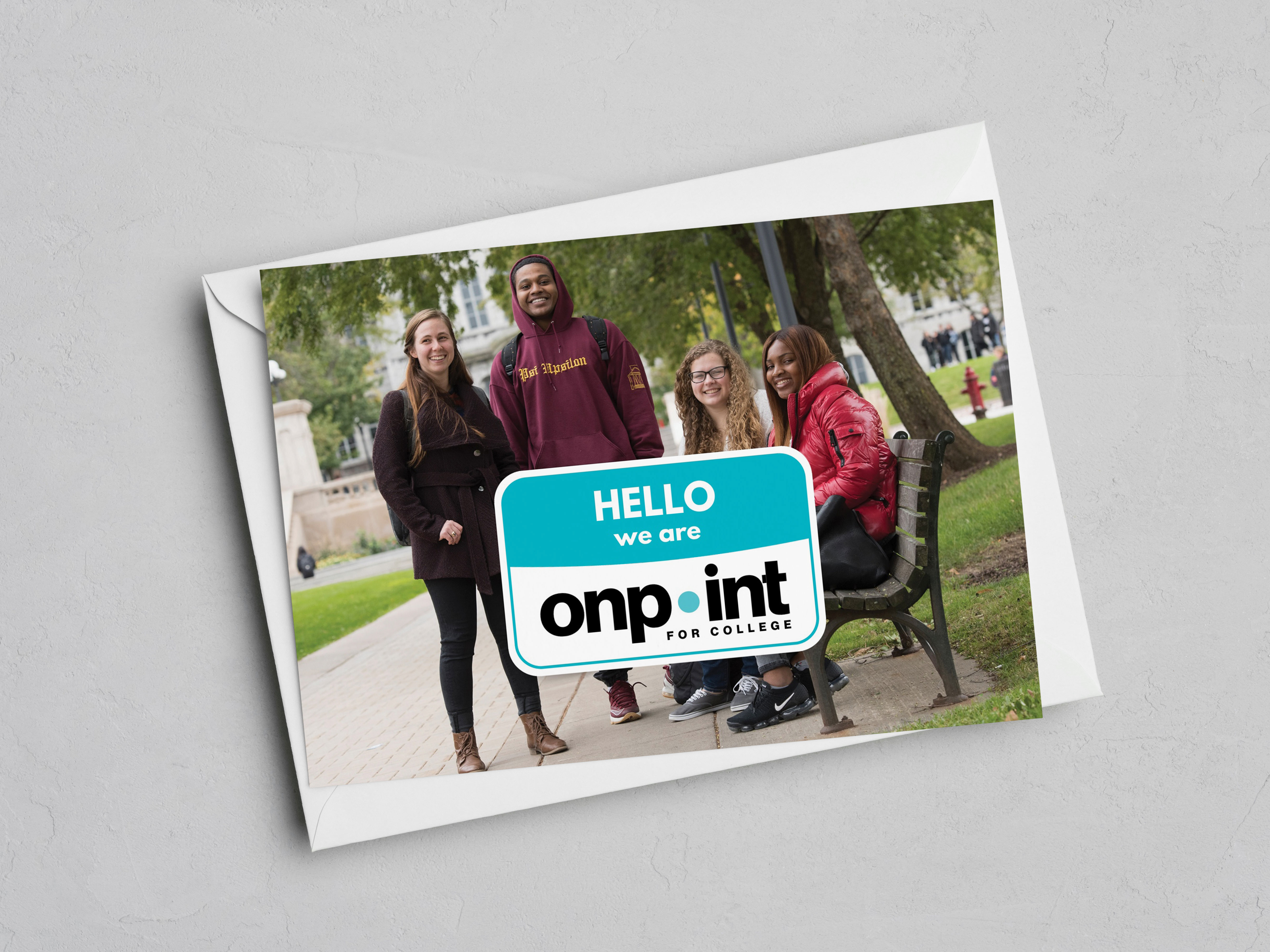
In 2025, the board and leadership initiated a soft, gradual rebrand, transitioning the name from On Point for College to simply On Point. This evolution reflects the organization’s expanded focus, supporting not only college-bound students but also those pursuing careers, certificates, and trades. The rollout is intentionally phased to ensure fiscal responsibility and smooth adoption across materials, departments, and audiences.
I continue to guide the implementation of the new identity, overseeing updates to print, digital, and event materials as On Point’s refreshed brand becomes fully integrated into its communications.
Below: a t-shirt, a business card, and the new website's homepage.

Guiding the Brand
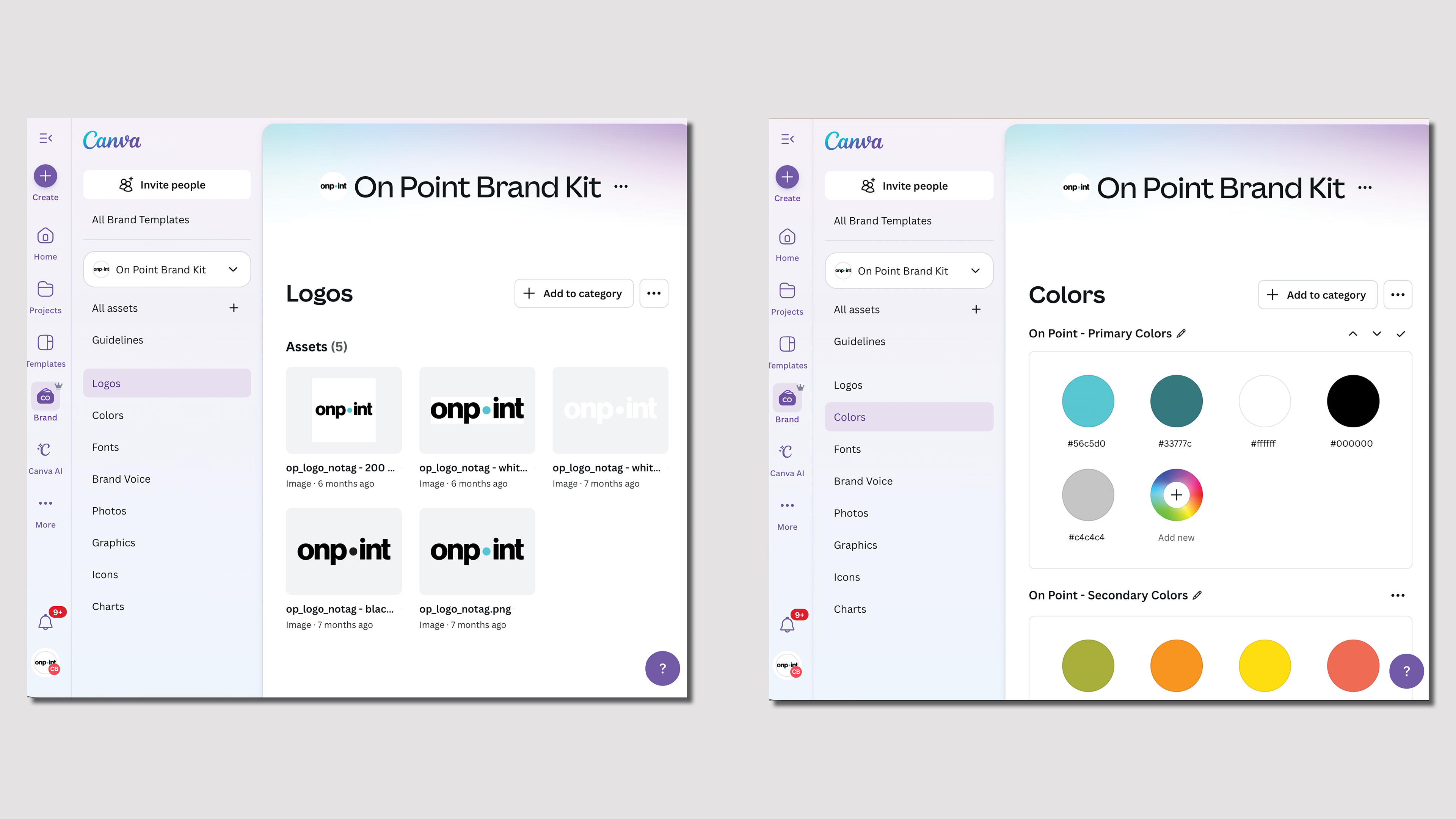
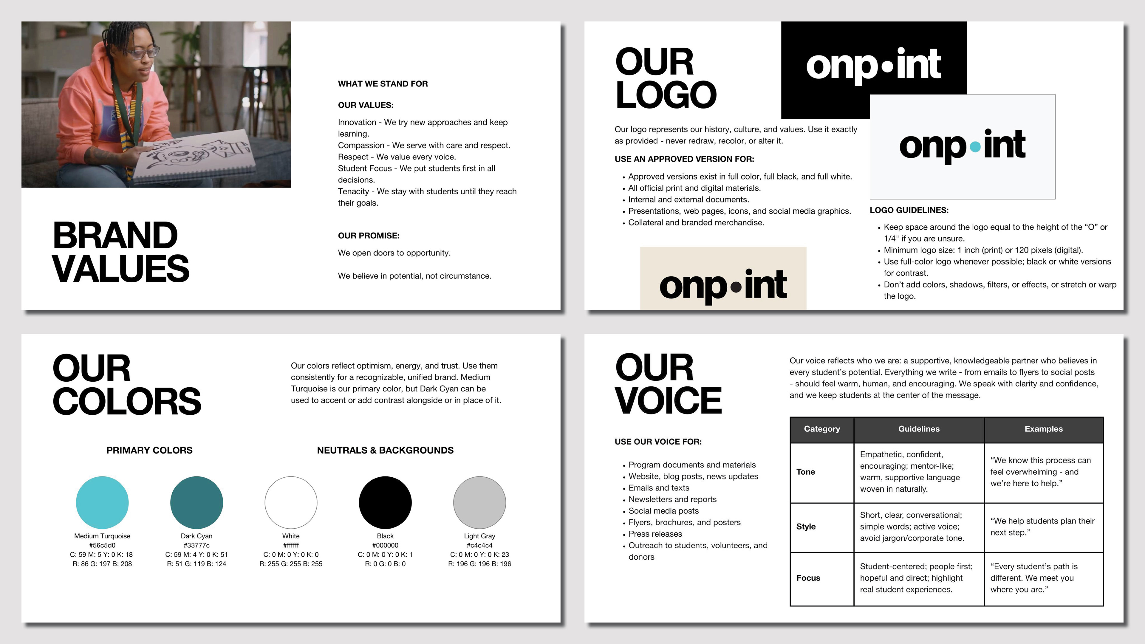
In 2020, I applied for and secured On Point’s "Canva for Nonprofits" account to ensure that staff had access to an easy-to-use, professional-level design tool. Within this platform, I set up and continue to maintain the organization’s Brand Kit, providing a centralized library of logos, colors, and templates for consistent, on-brand materials. As more team members create externally facing content, I am finalizing and preparing to present comprehensive Brand Guidelines to clarify appropriate brand usage. Together, these resources will make high-quality design accessible across departments and help staff represent On Point with consistency and confidence.
Below: screenshots from On Point's Canva Brand Kit, our new Brand Guidelines, and excerpts from the Brand Guidelines.